Now that the new Studio Ghibli animation is in movies in Finland...
...there's also a new complete edition of "Tales From the Earthsea" (parts 1-4) in bookstores. I did the cover art for 2002 editions of Le Guin's classic fantasy book series, and the publisher wanted me to do cover art for this edition also. This was a little bit hard job for me, because I'm a huge fan of Le Guin's books and this time the publisher wanted me to do a cover that I wasn't so sure of.
When I did the cover art for Finnish edition of "Howl's Moving Castle", it was a same kind of project. There was an animation that's very different from the original book, and the publisher wants to do a cover that resembles the animation but still is the cover of the book. And I'm very pleased with the cover art for Howl. Partly because I don't have a serious relationship with the original book and partly because I did a much better job for Howl than what my new cover art for Earthsea is :) . But I did not really like the idea that the cover of Earthsea had these elements that they wanted. I did it anyway. Sometimes it's like this, you have to do what your client wants you to do because they pay you for that. The publisher wanted to get new readers of those people who liked the movie but haven't read the original.
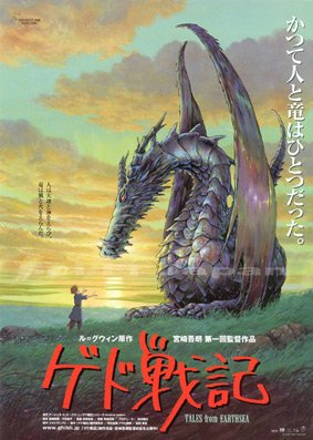
So the case was that the cover should have the same composition as the anime poster above. First I did a sketch (I'm sorry I don't have it anymore, I think the sketch was the best version of this), and then after my publisher accepted the sketch started to work with the illustration. First I did this version, which was coloured the way I wanted it to be, very gray and cold.
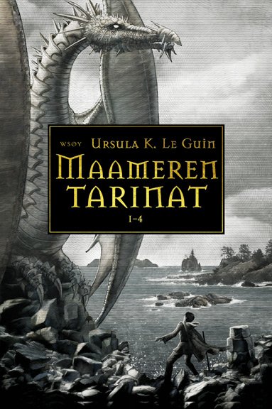
For me the Earthsea is greyish and cold, filled with nature that is beatifull but merciless and the air smells like salt and fish. For me this coloring had a feeling of the Earthsea. And I wasn't happy with the fact that Earthsea cover now has a wizard and a dragon (a fantasy book with a wizard and a dragon, not very groundbreaking) but the lack of colors kind of brought back the dignity.
I used the same typography as in my earlier Earthsea-series. Otherwise still using the font Mason in fantasy covers would be pretty lame.
The publisher and the marketing people however weren't happy with this version. They wanted the same colorfull feeling than the anime poster has, and also the same typography than the Finnish version of the anime poster has.
So I did this version.
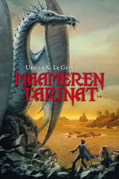
My client liked this version much more so this got to be the cover. At that time I was very disappointed because I liked my first version much better. Now, I'm not sure which one is better. Both have good parts and bad parts. Someone said that he/she doesn't like the statue-like feeling of the dragon, but I'm quite pleased with it. But the old style gray of the first version suits the dragon more.
I'm pretty sure that I'm not going to put this cover to my portfolio but still I hope some people like it anyway! And Earthsea is a great series of books, actually everyone should buy them!
(By the way, I'm not pleased with the anime eather. I'm huge fan of father Miyazaki but I didn't like he's son's debut even a little, I'm sorry to say. Of course the pictures are very beatifull but as a movie it doesn't work for me. Usually Ghibli's films have a great joy of telling a tale, they are fantastic and filled with great intelligence - in a very entertaining way. This didn't have any of those elements. One reason may be that perhaps Earthsea is not the best story for Studio Ghibli's style?)
Kommentit