keskiviikko, 12. syyskuu 2007

Making of Talvikuningas (part1)


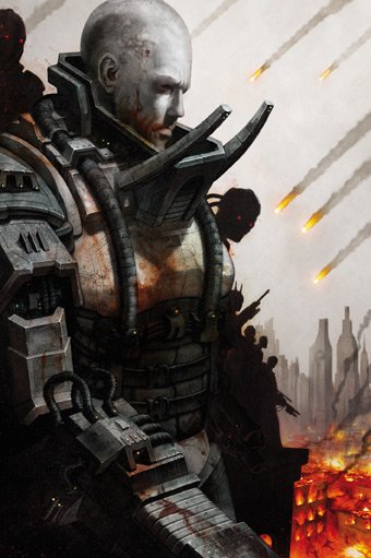
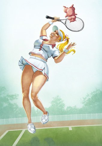
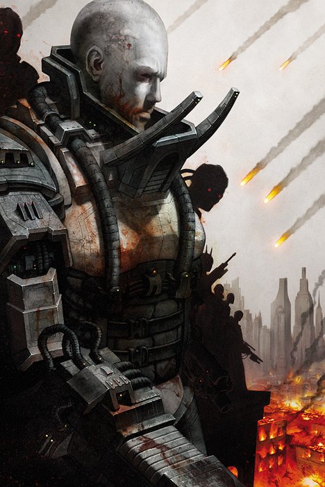
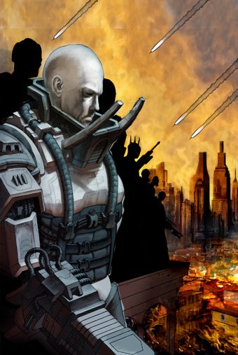
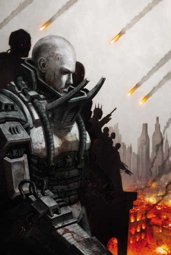
I'm going to do couple of "making of"-posts about the illustrations of Talvikuningas. I put three illustrations (of 13) to my portfolio, and here's one of them. It's called "Pretoriaanikyborgit", and it is the third track of the album.

894921.jpg 

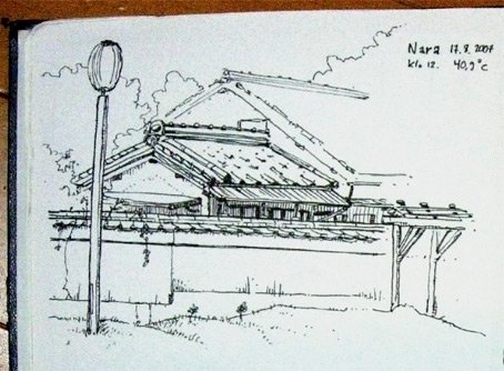
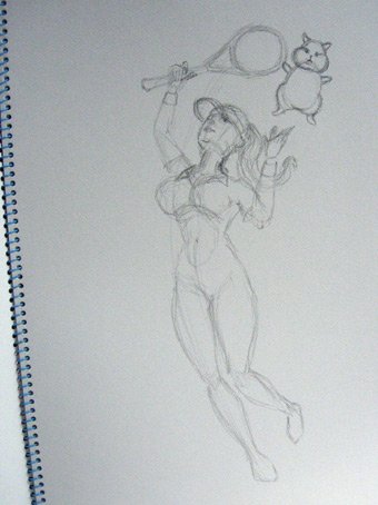
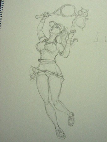
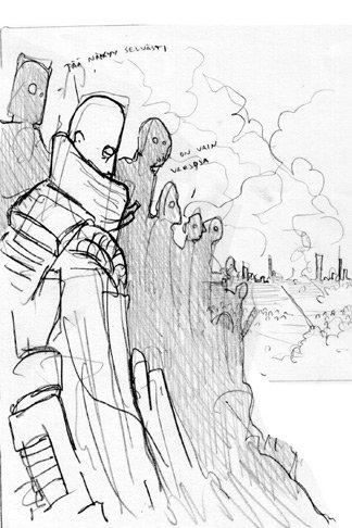
I'll put here some versions of the work process, starting from the early illustrations. (For those who don't know, Talvikuningas is a theme album by a Finnish rock band CMX, with a science fiction story written by the lead singer & bass player A.W.Yrjänä.) At first I got the lyrics and then I made some sketches, this is one of them. (The other sketches were similar, only in different format because I didn't know at that time what the format of the illustrations.)
894918.jpg


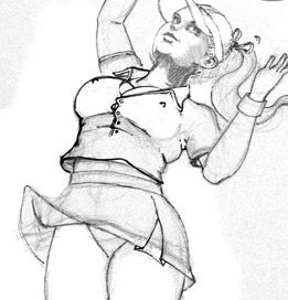
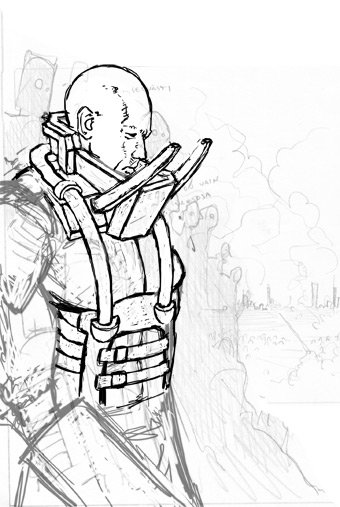
My client (the band and the record company) accepted the illustration and then I started to do a more detailed sketch over the rough one.
894951.jpg

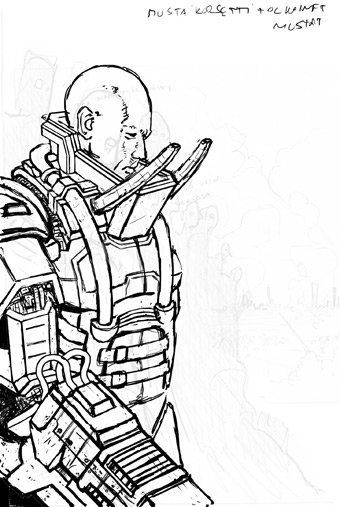
At that time I wanted the character to look a bit kinky. I planned to colour it the way that it looked almost that he's wearing lady's underwear, a corset and a bra. Later I skipped this.
894988.jpg


Then I again added more detailed and thinner outlines on a new layer. I also added some photos & stuff to the background, to help me to finish the sketch and as something to work from.
894992.jpg

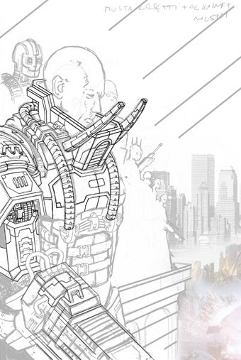
I did this picture with the same method as so many other of my pictures. I don't have a clear image of the final result in my head, but I have a very clear FEELING how it should look like. But I'm not sure how to get it so I just start doing it. I think I should do more sketches and more detailed sketches beforehand. Many times I have the same kind of problem as in this picture. When it's almost finished I realise that this isn't exactly what I'm looking for and I dont't get it right away what's wrong. Then I have to try to change the almost complete work (wich of course may be pretty hard) or do some parts of it again.

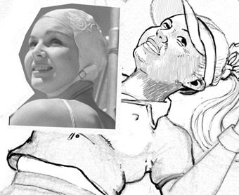
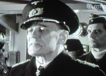
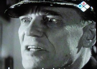
I had also had an image in my head how the main character should feel. I saw this old war movie "Sink the Bismarck!" and it had a super nasty nazi-villain it it, the captain of the battleship Bismarck. The actor's facial expressions were just pure evil. I don't know this for sure but I think it's possible that that the Emperor of the original Star Wars trilogy might be somehow based on this character! The Emperor has very similar facial expression and also very similar looking form of the face.

Here's the captain, a very bad man, and obviously proud of it!
895125.jpg

895126.jpg

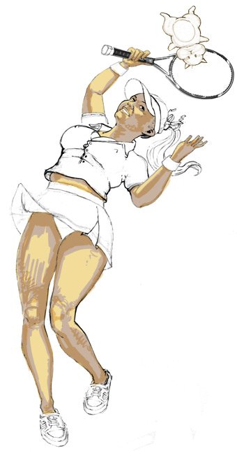
When the picture was almost final I had two versions of the main character (I don't have the files anymore), a face with an evil nazi grin, and this basic version. At that time I had chosen the version with the grin but now I'm very glad that my client did not like it. The author wanted this character to be just a working man, like he's just standing there after a hard day's work. He doesn't have to enjoy his work more than a normal salaryman. This was definitely the right decision.

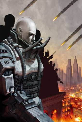
But let's get back to the sketches. I started coloring the thing and add more details to the background.
895003.jpg

895106.jpg

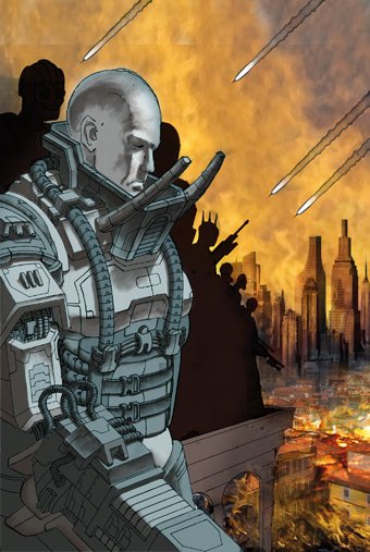
I changed the background color to a bit more gray and finished the burning city.
895174.jpg

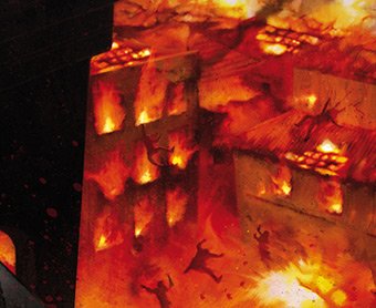
I thought about when I was a kid how much I liked Boris Vallejo's cover art illustration for Ozzy Osbournes "Ultimate Sin", and the little painted people suffering in hellfire under Ozzy-fly! So I wanted to do a few little people for the city. Here's a detail of the final version.
895313.jpg

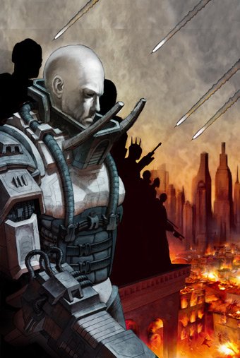
The picture started to have an evening atmosphere in it. I wasn't sure I liked it. It somehow looked too romantic.
895193.jpg

So I took away more colors.
895230.jpg

But now I didn't like the composition anymore. I made a few changes.
895241.jpg

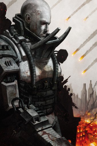
Now it was almost finished but still it didn't have the right feel to it. So I added some blood to the character! Then it turned out be ready and finished. Blood and dirt always helps! Now the character had the feel of cruelty I wanted it to have, but without any stupid exaggeration.
895256.jpg


torstai, 6. syyskuu 2007

A small interview in Plaza.fi


You can find a short interview (in Finnish) about making of Talvikuningas here.


maanantai, 3. syyskuu 2007

Sketchbook


I always keep a sketchbook with me everywhere I go. Usually I'm little bit lazy filling it, but sometimes, especially if I'm on vacation I very much like to sit down and draw. Zillion years ago when I was studying I always drew something while listening to lectures, but nowadays I don't do it so much. I keep my book with me also because if I get some idea of something, or see something interesting, I'll write it down.

Me & my wife did a quick trip to Nara and Kyoto couple of weeks ago. Here's a few quick drawings from my sketchbook.

873797.jpg

873010.jpg

873011.jpg

873807.jpg

873013.jpg

873014.jpg

This one's from a park near by our house in Shinjuku.
873721.jpg

keskiviikko, 29. elokuu 2007

Making pinups


I just started on working on the sequal for my early pinup calendar "Mistreatment of Bunnies 2006". The part II is called "Hard Times for Hamsters 2008", so it's basically the same idea again. 12 chubby pinups with animal cruelty! Here's the first pinup. I thinks it's for June, I'm not sure yet.

861539.jpg

As the previous calendar, this one is also a "omakustanne". But for doing this one I got a stipend from the Finnish Society of Illustrators, "Kuvittajat ry", thanks very much!

So I don't have a publisher (yet, please feel free to give me a email if you are interested in publishing this!) and I'm doing this almost just for fun. For "Mistreatment of Bunnies" I printed a limited edition of 200, about half of it I sold to get the printing costs back, and the other half I used as a giveaway present for clients or as a part of my portfolio. I also send copies to different publishers, mainly to U.S. but "Mistreatment" was never officially published. A big westcoast art publisher called Last Gasp was at first very interested in publishing my calendar in the States, but then they suddenly lost their interest. I don't know what happened but I think I'll send them this new calendar too and see what they think of it.

This time I'm also printing 200 copies and I  should finish this by the beginning of October if I'm going to sell any of these. So I hope I can do this in time.

Here's a little about making the painting. (Or a picture. As you'll see it hasn't got anything to do with paint.) OK, one of my best buys in Japan is this!
860552.jpg

I also bought a little bit more complicated (and more expensive) male version.
860554.jpg

I actually did not know that you can buy these kind of modeling dolls from the art store. In Finland you only have these crappy wooden dolls with basic geometric shapes. For me these are amazing! As I've said before I have difficulties with making right poses and I need to have something 3D for making the composition. And these guys do the job for me just right!

So I started doing a sketch. First a quick scratch.
860555.jpg

Then a more detailed one.
860556.jpg

I scanned the sketch and continued it with Photoshop. I usually make the final skecth in Photoshop, it is easier for me. I was not happy with the way the face started to look like. It seems that without a photo reference I can draw only a one type of face even if I try to do something different.
860558.jpg

So I had to borrow the face from an old vintage stock photo I found.
860559.jpg

Then I got the sketch almost right and started to work with the colors.
860560.jpg
First I did the skintone.
860561.jpg

Then the clothes.
860562.jpg

A thought I'll try to do the pictures for the calendar with a not-so-realistic style. I use more comic like shadowing, the foldes of the clothes don't have to be just rigth and the lights on the skin can be a little bit stylised. I like very much classic 50's style pinups and hotrod pinups. They are not so over-realistic and that's why they look so awesome. I don't like the painting to really look like it's been painted from a photo. Pinups of Sorayama or Luis Royo are not my cup of tea. I like Coop!

After I got the posture right I sketched the background.
860564.jpg

I didn't like the round tennis court. It looked dull and heavy.
860565.jpg

So I made the background a little bit different as you can see if you look at the final picture on top of this post. Now its about finished. I'm going to do all the other 11 pinups and then then make some final corrections to all of the pictures.

PS. Another superior item I bought from Japan:
860571.jpg

I normally use Rotring 0.25 for making the outlines, but after I found this I haven't used Rotring since. I'm no sure what is the name of the pen, I think it's School-G and it says also "Tachikawa". I bought this from an manga store from Tachikawa so could this be their own pen? I don't know. But this pen is magnificent. If pressed lightly the line is even thinner than Rotring's, but if pressed harder the line gets thicker. This pen also slides on paper 10 x better than Rotring ('cause you'll have to use Rotring in a certain position, you can use this anyway you like). Yes, I like!


lauantai, 11. elokuu 2007

Tales From the Earthsea


Now that the new Studio Ghibli animation is in movies in Finland...

814240.jpg

...there's also a new complete edition of "Tales From the Earthsea" (parts 1-4) in bookstores. I did the cover art for 2002 editions of Le Guin's classic fantasy book series, and the publisher wanted me to do cover art for this edition also. This was a little bit hard job for me, because I'm a huge fan of Le Guin's books and this time the publisher wanted me to do a cover that I wasn't so sure of.

When I did the cover art for  Finnish edition of "Howl's Moving Castle", it was a same kind of project. There was an animation that's very different from the original book, and the publisher wants to do a cover that resembles the animation but still is the cover of the book. And I'm very pleased with the cover art for Howl. Partly because I don't have a serious relationship with the original book and partly because I did a much better job for Howl than what my new cover art for Earthsea is :) . But I did not really like the idea that the cover of Earthsea had these elements that they wanted. I did it anyway. Sometimes it's like this, you have to do what your client wants you to do because they pay you for that. The publisher wanted to get new readers of those people who liked the movie but haven't read the original.

So the case was that the cover should have the same composition as the anime poster above. First I did a sketch (I'm sorry I don't have it anymore, I think the sketch was the best version of this), and then after my publisher accepted the sketch started to work with the illustration. First I did this version, which was coloured the way I wanted it to be, very gray and cold.

814267.jpg

For me the Earthsea is greyish and cold, filled with nature that is beatifull but merciless and the air smells like salt and fish. For me this coloring had a feeling of the Earthsea. And I wasn't happy with the fact that Earthsea cover now has a wizard and a dragon (a fantasy book with a wizard and a dragon, not very groundbreaking) but the lack of colors kind of brought back the dignity.

I used the same typography as in my earlier Earthsea-series. Otherwise still using the font Mason in fantasy covers would be pretty lame.

The publisher and the marketing people however weren't happy with this version. They wanted the same colorfull feeling than the anime poster has, and also the same typography than the Finnish version of the anime poster has.

So I did this version.
814277.jpg

My client liked this version much more so this got to be the cover. At that time I was very disappointed because I liked my first version much better. Now, I'm not sure which one is better. Both have good parts and bad parts. Someone said that he/she doesn't like the statue-like feeling of the dragon, but I'm quite pleased with it. But the old style gray of the first version suits the dragon more.

I'm pretty sure that I'm not going to put this cover to my portfolio but still I hope some people like it anyway! And Earthsea is a great series of books, actually everyone should buy them!

(By the way, I'm not pleased with the anime eather. I'm huge fan of father Miyazaki but I didn't like he's son's debut even a little, I'm sorry to say. Of course the pictures are very beatifull but as a movie it doesn't work for me. Usually Ghibli's films have a great joy of telling a tale, they are fantastic and filled with great intelligence - in a very entertaining way. This didn't have any of those elements. One reason may be that perhaps Earthsea is not the best story for Studio Ghibli's style?)